Thursday, November 26, 2009

iTunes to the rescue

Photo Credit: Wallet Pop.com

I’m a twitter stalker and I’m not ashamed of it, actually I’m a little ashamed but that’s beside the point. The point is, I was looking on the magnation twitter feed when some bozo posted about how those magnation people were ‘deluded fools’ because print is dead, apparently.

Amongst this little twitter war I discovered a Guardian article that was relevant to this issue. According to The Digital Content Blog, publishing powerhouses Hearst, Time Inc and Condé Nast are teaming up with iTunes to create online storefronts for their digital publications. Whilst I have already expressed my feelings towards publishers charging for online content, I think this is a brilliant move. Despite the threat it poses to the print medium, iTunes has become a beacon in online usability. Music, film and talkback radio have been ‘saved’ by Apple cause no matter what they produce, consumers will flock in record numbers with iTunes cards in hand to purchase the latest releases.

Take that @print_is_dead, I will no longer be stalking your twitter.

Felix GT

Photo Olivier Zahm, Purple Diary. Felix Gonzales Torres, Untitled 1991

I have mentioned before how much I love Google reader. Apart from it being a great time wasters, it helps me keep up with the wonderfully creative happenings in Melbourne, Berlin, Dubai and New York to name a few.

One of my all time favourite artists is Felix Gonzales Torres. I love him so much that for one of the projects I had to do in art school last year I payed homage to him in the form of a table a chair. Whilst I will be the first to admit that they didn’t work out exactly as planned, actually they were quite shit, it cemented my adoration for the late artist.

Thanks to Google reader I discovered that the new High Line (one of the most amazing new concepts in urban development) in New York City is paying its own version of homage to Felix GT. One if the things he was most well know for was his billboards that were installed in various locations around New York at the height of his career in the 80s and 90s. Gonzales Torress was committed to social issues surrounding gender, politics and sexuality. Documented on the purple journal blog, one of the artists most know billboards has recently been erected behind the Standard hotel in New York City.

Untitled, 1991 appears on a building in 13th street, and anyone unfamiliar with the artist will undoubtedly be wondering what it’s an advertisement for. The image is of an unmade, recently vacated double bead with white, ruffled sheets and the overwhelming presence, or in this case absence, of two lovers.

My apparent aversion to public art (as per my critique of Valhalla) is in no way extended to this billboard. I think we need more of them. In a world where advertisements cloud our vision and find their way into our personal space, it is refreshing to see an image in the public realm which references nothing in particular but which still speaks volumes about life.

This enigmatic artists will continue to be missed!

Sunday, November 22, 2009

Gadget Envy


photo credit: Business Week

Ok so I really want an iphone and part of the reason I really want an iphone is I suffer from rampant gadget envy, always have. It started when I was little, first it was Nintendo, then it was super Nintendo then I think I got over the whole video game thing and for a while I was into upgrading my cyber shot cameras. Now it’s about mobile phones, ipods and laptops.

In addition to gadget envy I’m a sucker for packaging and in my opinion, Apple kill it. I still remember the first time I bought myself an ipod. I was in New York walking past the apple store in Soho and I was sick of roaming the city streets listening to nothing but crazies and car horns (although now both of those sounds make me quite nostalgic). I remember taking my new white cube back to the apartment I was staying in and opening it like it was some version of Pandora’s box. Everything was simple, white, clean and neatly packaged and I just loved it. Let us look at how they've evolved.......


photo credit: designarchives.aiga.org

photo credit: arstechnica.com


photo credit: farm4.static.flickr.com

An ipod photo and mac book later, the iphone is the new thing (new is a loose term, actually everyone has one) I covet, but optus won’t give me one cause they are mean and I don’t like them and they keep telling me I have to wait, but I don’t think I can wait. I really REALLY want an iphone!!!

Friday, November 20, 2009

cont'd


This is my first post since finishing uni and I decided to make it a pictorial one.


Photo Credit: Larry Clark

Photo Credit: Me


Photo Credit: William Eggleston

Saturday, October 31, 2009

Assignement 3 Part 2 Vol. 2

Designer Apps - The changing face of the mobile phone
November 2, 2009

With the announcement of the technology that was going to revolutionise the mobile phone, media player and PDA , Apple changed the way we use these technologies by launching their most anticipated product to date. The iphone, according to Apple has simply ‘redefined what a mobile phone can do’.

As of March this year, 30 million iphones had been sold proving that Apple are certainly the leaders in mobile technology. The hype surrounding the initial launch focussed on just how entertaining and convenient this technology was going to be.


In order to watch Pirates of the Caribbean and order calamari, the iphone employs an application system to enhance how users interact with the phone. Not only have iphones become the most popular mobile technology, Apple has also figured out an ingenious way to keep the customer paying. If you don’t actually own an iphone, an application or ‘App’ can be quite the foreign concept. Are they games, are they programs or are they media files, it doesn’t really matter because as of April 2009, 1 billion applications had been downloaded from the official Apple ‘app store’ and that number will only continue to rise. From games such as Crash Bandicoot to Texas Holdem and cooking aids such as Fromage a pocket guide to over 380 types of cheese, the app caters to every interest group imaginable.

The Mac book is a staple for most designers for it’s advanced operating system and the iphone has become a smaller more portable extension of it and with this of course comes the design focused app. Amongst them are; Airdesign Chair that calculates the size and square footage of any room and iBlueSky a brainstorming platform to help organise ideas into an emailable PDF document. No designer however will dispute the importance of the PANTONE colour library, which is now conveniently available as an application. Despite the disclaimer stating ‘colours displayed here may not match PANTONE identified standards’, the application is a very useful tool. Pallets can be created and shared and colours can be extracted from a photo and matched to the closest PANTONE colour.


Whilst the PANTONE application is a useful resource, there are certain apps that are just for fun.Type Drawing is an application that lets you draw with letters to create typographic art works. By selecting a font size, type and opacity, the user can build a picture from a simple concept.


Though most applications are really just a chance to waste time, there are some valuable guides to help navigate around they city you live in or travel to. Dexigner is a website and now application that connects a user to the latest design news, exhibitions, conferences and competitions. One of the more impressive aspects of the app is Near Me an extension of the online version Around Me, which calculates the users location and provides a complete list and distances to design related events or centres near by.


Apple are renowned for usability and this convenience is now portable and small enough to fit in your pocket. With the help of such an array of unique applications, users are encouraged to be more productive, stay entertained and turn their phone into whatever they want it to be.

Assignement 3 Part 2 Vol. 1

Greece is for lovers of witty and innovative product design.
November 1st, 2009


Gathering inspiration from your surroundings seems to be a common starting point for most creatives. Gathering inspiration from surroundings, cultural stereo types and adding a slightly ironic sense of humour can begin to explain the unique designs emanating from the Athens based studio Greece is for lovers.

The trio of Vasso Damkou, Thanos Karampatsos and Christina Kotsilelou make up the uber cool product design company that is part of the evolving face of the new Athenian creative culture. Their unique designs and indeed their name is a reference to the kitsch and cliché Greece the world has long remembered. From curtains that map out traditional Tsamiko dancing, to the brilliant ‘Tougher then Leather’ skateboard commissioned for 7ply Project Exhibition the company has gone from strength to strength and are the poster children for the citys’ new image.

'Tougher than Leather' - G.I.F.L

Since the 2004 Olympic games, Athens has experienced a cultural boom that is placing the city in contest with its European neighbours. Not only has the New Acropolis Museum provided a symbol for the country’s cultural renaissance, smaller more niche studios and artists have begun to present themselves on the world design stage. Amongst them are; Poor Designers a collective of young graphic designers working out of Athens, Kostas Voyatzis, founder of the design website yatzer.com and of course Greece is for Lovers. Their studio is located just outside the Plaka district which is known as the place where old Athens, new Athens, tourism and culture clash. This particular combination is at the basis of most of their works. Taking elements from Greece’s classical aesthetic, mixing it with the country’s casual culture and adding their own unique brand of humour, Greece is for Lovers have contributed to the vibrancy that seems to be fueling the city.

The name Greece is for Lovers is a play on the slogan ‘Greece is for Greeks’ which, along with the rise of populist leader Andreas Papandreou marked the unofficial beginning to reclaiming the Elgin Marbles an issue that has plagued the cultural identity of Greece for the past few decades. According to Vasso Damkou ‘Greeks don’t like to work; we prefer to chat up tourists in the afternoons, indulge in huge meals afterwards and smash plates.’1

Whilst some may still have this perception of Greece, Damkou, Karampatsos and Kotsilelou have combined the stereotype, added a 'tongue in cheek' comic aesthetic and injected into their products. Mugs with ‘Athens Sucks’ displayed as a parody of the infamous ‘I heart NY’ logo and a set of plates title ‘Greece Vs China’ that look like they have been smashed and reset are proof that despite constant reminders of the glory days of classical Greece or the lazy sun loving image perceived by the rest of the world, Athens has a new love of innovative and witty creative talent.

'Greece Vs Chine' - G.I.F.L
'Opa Curtains' - G.I.F.L

Tuesday, October 27, 2009

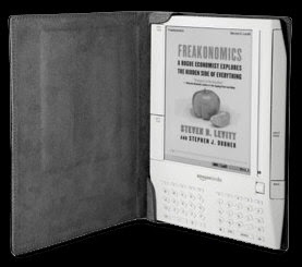
Kindle Vs Spying on the person sitting next to you

photo credit: XML Aficionado

I have an anecdote to share which nicely describes the effects i think the Kindle will have on the public sphere. It is bad enough that everyone in transit either on foot, bikes, trains etc are talking on their phone or listening to their ipod. Reading granted is a similar solitary and unsociable activity but the cover of a book suggests something about the reader/stranger sitting next to you.

This particular anecdote is not my own but my sisters however i'm sure we all have a similar story. She was sitting on an otherwise boring/frustrating/excruciatingly full train in peak hour getting exceedingly impatient until she saw something amazing. Crammed in one of those little single seats near the door was a very large man who could have easily been a basketballer in his spare time, dressed in a business suit, surrounded by people looking at their blackberries, reading a book. What book you ask warrents a blog post? New Moon, the second installment of the Twilight series. If it were a Kindle, this man could have kept this indulgence a secret and my sister would never have survived the train trip. But luckly the Kindle has only just been announced for purchase in Australia. The convenience of this technology is indesputible especially for students who have to battle daily with a million and one text books and for Nick Cave fans whose title The Death of Bunny Monroe comes as an enhanced electronic version complete with original compositions.

However the activity of reading, and the secret pleasure everyone gets from spying on a fellow comuters readings habits will sadly be lost. It is up to the Kindla or Apple to come up with the digital equivilent of a book jacket so we can still spy or pry and have the convinience in one little package!

Saturday, October 17, 2009

Impromptu Arts Festival Review

Valhalla by Callum Morton, Palazzo Zenobio Venice 2007


After spending a good part of lesson time during Thursday nights Art Curatorship class writing a press release for Callum Mortons Valhalla, I literally could not wait to see it. The work was re commissioned as part of the Melbourne International Arts Festival and it sits outside the Arts Centre until October 24th.

The very next day in between the end of work and a friends engagement party, dressed in my ‘oh my god all my friends are getting married” finest. I went to the spot where this installation/remodel sits.

Valhalla was one of the works that represented Australia at the Venice Biennale in 2007. Callum Morton has created a personal work that reinterprets the home he grew up in that was designed by his architect father in the 70s.

Rebuilt by Morton at three-quarter scale, the house manifests as a smoking ruin: stripped out, torched and shot through with holes. It appears to rise up from the dead, a haunting from the artist’s past, certainly, but also as an un-monument to modern order and a symbol of contemporary instability. MIAF Press Release

I had seen a number of images and read a number of articles about the structure both at the time of the biennale 2 years ago and recently in the pre buzz to the arts festival and I thought I knew what to expect. Valhalla sat in a clearing in Palazzo Zenobio in Venice. The scene complimented the post apocalyptic ambiance of the piece so well that it received extensive critical acclaim not to mention significant envy towards anyone who was lucky enough to actually see it. Now it resides in the space between the NGV and the Art Centre, caged by the Spire and the traffic of St Kilda Road. The structure also is not as big as the original work in Venice and while it’s impressive and evocative, it looks like a blow up castle from a children’s birthday party at the Adams Family home. Approaching the structure and as I inspected the surface it looked as if it was made from stirofoam. It's not as large as I had expected (the original work is roughly double the size) and it reminded me of those terrible haunted houses they had at the Melbourne show. As I turned to leave I heard one passer by exclaim “what the hell is that” to which their friend replied “dunno”, and they both kept walking.

It is hard to figure out why this work was recommissioned for the festival and why it was that the organisers chose this particular spot but the entire experience made me feel a little disappointed. Whilst recreation is effective in some respects, I would have preferred to remain envious of the audience members in Venice who were able to view the work as it was originally intended. If you don’t get the chance to see it during this years festival, I’m sure the ‘One time only Farewell Tour’ is already scheduled for 2012.


Valhalla by Callum Morton Art Centre forecourt, Melbourne 2009

Tuesday, October 13, 2009

Assignment 3 written for The International Design Magazine

Can design thinking change the world? *Living Climate Change from IDEO

In 2006 Al Gore was successful in making the public aware of their contribution to the issue of climate change in his film An Inconvenient Truth. On numerous occasions and in numerous ways this threatening issue has been addressed with a number of initiatives seeking to manage the problem. As a global community we have been told to change our habits, clean up our lives and adapt to a more eco friendly life style. Big businesses have adapted the way they promote their services and all over the world people are equipping their homes with the latest in carbon neutral technology. But does any of this really make a difference? What exactly does our carbon footprint mean in the grand scheme of things and should we be looking at a different approach rather then merely adapting?

It seems whilst we are striving to make our lives ‘greener’ we have stopped the dialogue and lost sight of what the issues really are. The world is booming with countless innovations in technology and ideas and it was a matter of time before someone decided to take a different approach to tackling this growing problem. We live in a design conscious society, which is evident in the abundance of recognised branding. From Fashion to Transport and simply eating lunch livable design exists everywhere. We previously discussed the changing face of New York City thanks to the design conscious administration and now it seems this idea is expanding to help change the way we discuss the worlds altering condition.

Tim Brown, CEO of design firm IDEO is attempting to change the world through design. Many have tried, some have been successful, some have failed mostly the ideas have not reached far enough. ‘Design Thinking’ is Brown’s attempt to pioneer a mission that fuses design, business and social consciousness to create a researched and understood set of ideas. Brown understands how creative thinking works and is intent on encouraging a dialogue using a platform that everyone is familiar with, the Internet. IDEO recently launched a site called Living Climate Change. This site is will be an open forum that encourages users to share their ideas on this global problem. Living Climate Change is available to everyone and encourages discussion and experimentation that may change the global perception of this issue. Simply put livingclimatechange.com is attempting to expand the conversation.


Both through this forum and in his book ‘Change by Design’, Brown insists the site “invites you to imagine what life will be like in 20 or 30 years, as we move along a path toward reduced carbon emissions. Will the targets be reached? Which behaviours will need to change? Which will we choose to preserve?” By redesigning a conversation that has been attempted numerous times Brown is injecting much needed innovation into the issue and encouraging the global community to explore design thinking and maybe change our future.


Your home as art: looking at the style aesthetics through online DIY design.


*photo credit to Todd Selby, theselby.com

We all know how important it is to have a haven. The place you go after a long day, long flight or long lunch and can just sit and relax, expelling the world and switching off. Environment plays a big part in who someone is and the way they create which is why it is so fascinating to be able to take a look into someone’s living space. The popularity of style blogs proves how interesting what someone wears is and now it seems their design ideas are just as intriguing. The growing popularity of websites such as The Selby and Apartment Therapy prove just how interesting your living room can be.

What these sites have in common apart from a home design focus is the emphasis they place on personality. Whilst they provide insights into where the reader can purchase the latest Ralph Lauren paint, they also look at how much of themselves people put into their living spaces. Just as Jackson Pollock literally included a footprint in his canvases, these living environments hold as much of the owners identify as the work they create.

Reminiscent of style makers such as Jak and Jil and Purple Journal, The Selby takes a look at ‘interesting people and their creative spaces’. From fashion designers to magazine editors, chefs and models, Todd Selby has taken a unique approach to capturing the identity of his subjects. The focus of his striking photography is not only on the person but on what he or she chooses to surround themselves with. From posters on the wall, the colour of curtains, animals in the background and Paris themed ashtrays, the website delivers unique and personal interior design. According to the founder Todd Selby, the website was started in order to learn more about the person from their possessions and to explore the way personal space reflects personality. By turning apartments into the set of a photo shoot and with the growing popularity of the website, Selby has turned the home into art. The subtle hints and design tips embedded in each photograph has turned The Selby into the DIY interior design bible. The diversity of the spaces shown encourages design ideas that could help any reader turn an uncomfortably small kitchen into a functional cooking space. As important as putting the right clothes on ones back this site proves that clever design transforms any living environment.

Taking a slightly more overt approach to constructive design tips, Apartment Therapy is said to be ‘saving the world one room at a time’ by providing a forum to explore ideas and create a more beautiful, organised and healthy home. With posts that celebrate clean lines of Scandinavian design and 100 different ways to use fairy lights, Apartment Therapy encourages innovative options for creating the perfect home. The website also profiles the most unique and accessible resource tools such as Lonny Mag. This title is revolutionising the humble magazine, recently relaunching itself as an online publication complete with turning pages and working links. Their mission is simple ‘to reopen the doors of design by embracing an online platform and providing inspiration and access to products and resources to readers.’

Whilst this is the motto for Lonny Mag, it can extend to include The Selby, Apartment Therapy and online forums like them that seek to celebrate creativity that transforms our homes into livable design.

Written for I.D. - The International Design Magazine

Wednesday, October 7, 2009

Relationships

In honour of our class group activity this week that challenged us to act out misunderstandings between online communities and the publishers that host them, I was reminded of a very funny little video I received in my inbox the other day. I work with designers so this is slightly design-centric but nevertheless a great portrait of how relationships could be changed if only we were clear and direct with our intentions. Plus Robots are cool!


*Thanks to mentaldesigner for posting thing on youtube

Tuesday, September 22, 2009

because it's the holidays and I want to talk about clothes

I know i have already mentioned how much I love my google reader. It's there whenever I need to just switch off and look at pretty pictures and read about pretty things.

So since my little 'ode to the reader' post previously, i began to consider the blog phenomenon and what it means to certain industries. I have decided that I am a very nosy person, not that I'm overcome with the need to know everybody's business (of course I want to know that too) but i'm also interested in the little things, like why someone ordered pasta at lunch instead of the chicken baguette or what made them buy that over sized fuchsia knitted jumper?

The jumper however is what consumes most of my interest and considering the popularity of fashion blogging, apparently everyone else wants to know too!

I like to look at the photos from purple DIARY (see below) which basically presents images of a whole lot of exhibitionists who turn the viewer (i.e. me) into an exhibitionist. Olivier Zahm has created an empire out of his photographs portraying models, musicians and of course himself being fabulous. Similarly style bloggers like the Sartorialist and Garance Dore (who incidentally just got married and became the worlds first style blog power couple) have made their mark (and money?!) from travelling the world taking photos of hot people in hot clothes. However, once these photographs were not available to the masses and we could only wonder what amazing things went on behind the doors you couldn't get in to. As previously mentioned I'm nosey and if I am then other people are.

Along with the style comes the gossip, the bitching, the shopping and the stalking each one contributing to a significant shift. When previously this industry was unaccessible, now, on the internet, more and more people can be voyers to a once very exclusive club.

My Reader

This isn't an official post, I just wanted to say I love my Google Reader;

Saturday, September 12, 2009

The future of the print ad: would you hang a screen on your wall?


These and many more exquisite posters are available for purchase from International Posters.

Recently I visited the Ian Potter Gallery on campus to look at a selection from the Gerard Herbst Poster Collection. They are beautiful! Thick vibrant screen-printed imagery in bold colours advertising everything from the Nazi Party to an Italian dubbed Sophia Loren movie. I would gladly display anyone of them in my home but I began to think about the effects digitisation will have on the printed ad.

According to the History of the Poster first printed by Phaidon on 1971, posters are ‘barometers of social, economic, political and cultural events designed to draw attention to social message, publicize products and invited us to events.’1 Apart from not being able to remember when the last time I received a paper invitation was I realised the printed ad might be an endangered species. Though marketers are still ever present in society, according to research printed in Advertising Age earlier this year, the way in which they chose to attract their audience is focused on hard objectives, such as specific market-share gains, rather than soft ones, such as brand awareness or visual aesthetic.

Though it appears online and television (though the advent of TiVo is threatening the commercial break) advertising allows for marketers to reach a broader audience, the actual design process has changed and the poster may be dead.

Back to the Future part II saw Marty McFly travel to 2015 almost 5 years away and hanging in his future self’s house are screens displaying imagery that constantly changes - i wonder how long it will be before Apple invent this?!

1 Josef and Shizuko Muller-Brockmann, 'History of the Poster', New York:Phaidon, 1971

Monday, August 31, 2009

Assignment 1: NGA, MoMA and Melbourne Museum

In an age of unprecedented digital technology, not only is it ‘to the minute’ news being sought on the web, but a large section of the global community shops, corresponds, researches and entertains themselves online. The Internet is now responsible for providing a service to the public by allowing as much access to information as possible. In 2005 Rupert Murdoch gave a speech to the American Society of Newspaper Editors expressing his concerns, apprehensions and inevitable excitement about the advancement of online technologies and the effect they will have on news publishing. ‘Consumers between the ages of 18-34 are increasingly using the web as their medium of choice for news consumption’. In his discussion he emphasises the importance of realising that the next generation of people accessing news and information have a different set of expectations. ‘The challenge is to deliver the news in ways consumers want to receive it – what do we need to do to be relevant to digital natives?’1 In a society where over 1 billion people use the Internet it would be a mistake for newsvendors and most other industries to ignore the changing tide. Whilst Murdoch was speaking specifically about the global news his audience could have easily been replaced with museum and gallery directors. Arts organisations have been in constant argument about the threat the Internet poses to the museum tradition. Despite the current embrace of online collections and social networking such as facebook and twitter, it is vital to look at the road it has taken to get there in order to determine the journey that still lies ahead.

Adding to the already extensive list of resources and applications available to online users, mega empire Google launched the most groundbreaking addition to art online to date. In January 2009 Google Earth added The Prado Museum in Madrid, Spain to their list of maps allowing art lovers the chance to view works from an entirely new perspective. This according to some critics is the death of the museum as we know it while others recognise that online ‘galleries simultaneously reaffirm traditional definitions of museums and suggest critical challenges to them’ 2. In spite of this great departure from museum traditions, the digital era is certainly upon us and it is vital for creative organizations to listen to what their developing audience wants. Whilst some organisations and institutions have been reluctant to develop online, the National Gallery of Australia, Museum of Modern Art and the Melbourne Museum are the focus of this analysis and are three examples of how public information can be communicated in an online environment. Museums typically embody object-oriented collections whilst using text insight to enhance the experience, however when this experience changes mediums a host of new necessities arise. Visual display, audience base, content and navigation all need to be considered in order to create a successful resource. For many years the Tate online has been a font runner in the development of museums online, winning numerous awards and implementing highly successful digital programs such as ARTmap a tool to physically map the museums collection and a highly successful games section designed for children. As a result of these programs it seems the Tate has been an inspiration to many local and international institutions. As previously mentioned this paper will explore the developments in online technology with regards to the National Gallery of Australia’s online essay resource, the Melbourne Museums’ discovery centre and the Museum of Modern Arts online collection.

In 1994 Leonard Will wrote the online resources version of the Murdoch speech in which he outlined how ‘information centres’ such as libraries and museums will excel in a digital future 3. Though Will did predict that the tradition of the printed word would resist digitisation, enter Google books and Kindle, his call to standardise electronic access to catalogue data has resulted in a much more user friendly resource system. One of the leaders in both the physical and virtual art world is the Museum of Modern Art whose online collection is one of the most successful. Visual information can be expanded on in a digital collection and museums can provide in depth analysis about the artist, technique and historical context. MoMA has developed an immensely engaging and informative resource for students and the general public. The catalogue section of their website is divided into categories including Prints and Illustrations, Architecture and Design, Media and Performance Art, Drawings, Painting and Sculpture, Photography and Film as well as a link to an index of art terms for those who need a bit more help understanding post modernism. Each section is alphabetised by artist, each artist is represented by an image of their work, and each work includes links to predominantly internal information as well as related items that may be purchased at the online MoMA gift store. Aside from obtaining the perfect teakettle to compliment a constructivist propaganda poster, the museum has managed to combine e-commerce with art history. The site is enjoyable, moderate to navigate around and is visually well designed however there does not seem to be enough text based information to compliment the visuals. This issue seems to be one of the most apparent hurdles of online museums; how do institutions combine the necessity of art theory with such a visual, fast paced medium?

As an extension of the valuable resources these online catalogues have become Leonard Will’s article also emphasise how vital it is to recognise the broader community, the need to encourage virtual interaction in the form of questions and answers and the ongoing development of user defined websites, in short public information for the public. When the importance of web writing became apparent a set of unofficial rules were conceived to make readability more convenient for users, however when compared to the traditions of art theory the difference is extreme. Countless analyses of web writing 4 stress the importance of simplicity. In articles such as ‘Editing for the Web’ short ‘skimmable’ content is preferred because, according to these experts, readers do not like long scrolling pages and they tend to lose patience when reading online material5 . According to this analysis by Dorothy Bowles, graphics, animation and multimedia applications will attract the most attention however in reality most websites, in particular museums, still heavily rely on written information.

The work of visionary Australian artist Imants Tillers are appropriations of imagery taken from various creative inspirations which to a degree is the basis of a successful museum website. Text based or visual imagery is paramount to the makeup of a good online resource and must be an extension of rather then replacement for a traditional museums experience. As museums change and more attention is payed to gift stores, cafes and opening nights, the digital medium has become the new mode for traditional viewing and reading with just a few added extras. Museums and galleries have copious amounts of information to provide their visitors with and careful presentation of this is crucial to a comfortable website experience. In ‘Design insights and inspiration from the Tate: What museum websites an offer us’, the importance of content organisation, navigation, style and presentation are emphasised. According to author Debra Riley-Huff these elements need to compliment the text based information provided and it is imperative for these sites to understand the importance of writing for the web 6. However when referring back to Imants Tillers and the extensive information available on the National Gallery of Australia website it seems the traditions of critical theory writing have triumphed. Judging from their list of essays, one would assume academics or postgraduate students are the target audience. The essays listed on Tillers are more similar to dissertations and they are definitely not simple and certainly not skimmable. Whilst the information is extensive it assumes that visitors have the patience to read 8 000 words on the artists’ ‘work in progress’ and if that is not adequate, there are 6 other titles of similar length to chose from. In spite of the lack of attention to short, clear and ‘internet friendly’ writing, the NGA is designed to inform and cater to art lovers who, generally speaking, may relish the opportunity to read in depth analysis on their favourite artists. However, in order for a museum to truly reach a broad audience, provide meaningful information and still remain true to traditions, a happy medium needs to be reached.


Rich, insightful and pleasantly surprising is the experience had when visiting the Melbourne Museum Website. The institution has achieved a multi-layered resource that combines text based and image based information. A clean and simple home page greets the visitor when first exploring the site with just enough visual and text material to navigate through the options. One of the most in depth sections is the Discovery Centre that divides the museum collection into active learning tools. Not only are students and adults able to choose between information on Frogs, Dinosaurs and Indigenous Cultures, they are also provided external links to relevant websites and downloadable information sheets. Each section has it’s own specially designed website that links back to the Museum Victoria and Melbourne Museums homepages. The cleverly designed website manages to provide a wealth of information in a simple and clear manner while taking into consideration the key criteria for successful web publishing.

The three websites profiled have three different agendas, visual style, audience base and online gift shops however they still represent the new age in public information. Though there is still some development needed, they continue to function as vital online resources. While some critics may be reluctant to acknowledge the advantages of virtual visitation and online resources, the benefits to public education is indisputable and future prospects are endless.


Rupert Murdoch, Speech to the American Society of Newspaper Editors, newscorp.com
L. Mctavish, ‘Visiting the Virtual Museum: Art and Experience Online’ in J. Marstine (ed), New Museum Theory and Practice, Oxford, 2006 p.235
Leonard Will, “Museums as Information Centers.” Museum International 46, 1 (1994): 20–5.
Jonathon Dube, ‘Writing news online’, Poynter.org: Much like other ‘unofficial’ rules to web writing, Dube outlines 12 basic steps to follow in order to create easy, short and tailored material.
Dorothy A Bowels and Diane L Borden, ‘Editing for the Web’, Creative Editing, Belmont:Wadsworth, 2000 p115
Deborah Riley-Huff, ‘Design Insights and Inspiration from the Tate: What Museum Web Sites Can Offer Us’ in Libraries and the Academy, Vol. 9, No. 1 (2009), pp. 79–98


Links (in order):

Newscorp: http://www.newscorp.com/news/news_247.html

Internet World Statistics: http://www.internetworldstats.com/stats.htm

Facebook: http://www.facebook.com/museumofmodernart

Twitter: http://twitter.com/melbournemuseum

Google Earth: The Prado: http://www.google.com/intl/en/landing/prado/

National Gallery of Australia: www.nga.gov.au

Museum of Modern Art: www.moma.org

Melbourne Museum: www.museumvictoria.com.au

The Tate Online: www.tate.org.uk

Google Books: www.books.google.com.au

Amazon Kindle: http://www.amazon.com/kindle-store-ebooks-newspapers-blogs

Thursday, August 27, 2009

PAY ATTENTION!!!

Since this class began I have been trying to get through all the bookmarks I saved to Delicious and Reader – The Daily Beast (probably got through a quarter of the email update, 4 more waiting to be opened), The Content Makers (never viewed), Jay Rosen Twitter (247 updates since I last checked) are amongst the 50 odd subscriptions I now have, not to mention doing the readings for 3 subjects, checking my personal, work and uni email address whilst texting my friend and updating my facebook status (Eleni says yes to Mad Men action figures).

BUT……..it’s not just me, according to Sam Anderson in an article written for New York Magazine (a subscription I have both in print and digital format) we live in a culture of Distraction. In In Defence of Distraction, he quotes economist Herbert Simon who states “…a wealth of information creates a poverty of attention.” But this isn’t really true is it?!

My primary school and high school reports were riddles with the same statements year after year. “Eleni is lacking Attention” “if Eleni focussed she would retain more information’. I went to school in the early 90s when the Internet was still being integrated into education programming. We did things one at a time and according to my teachers, I was still distracted. The irony for me is that whilst ‘power browsing’ grows, I feel I have become more accustom to this type of reading or research, and If I have, the kids who have grown up as ‘digital natives’ will have definitely acclimatised to the many distractions they are presented with.

One of Andersons key points is to embrace the so called poverty of attention because this time isn’t being wasted in fact we are learning to accommodate.

My question to you is, how much of what you read actually sticks?

Monday, August 24, 2009

This has nothing to do with writing and editing but......

Image part of AMC season 3 promotion

One of the best TV shows with the best dressed cast............thoughts?


You really think that’s what we want?

4 years ago Rupert Murdoch's plea to his fellow news makers emphasied the importance of refashioning their industry to include a greater web presence and the attention of 'digital natives'. His main emphasis was to give readers what they want, news on demand and a certain amount of control over the media.

The first time Murdoch 'challenged media orthodoxies' we were given the Fox Broadcast Network which, according to him, objectively and fairly delivers fast paced news.
Now, after a number of years deciding on an appropriate strategy, Fairfax has invited News Limited to give audiences what they want. According to an article i spotted on ninemsn, in order to cover profit loss, Fairfax are in talks with News Limited to introduce a fee for readers to view online content. Looks like despite the inspirational speech to the American Society of Newspaper Editors back in 2005, Murdoch has yet to come up with a better option.

Monday, August 17, 2009

My sister works at Penguin books and apparently one of the key source tools for new titles is blogging.

The Sartorialist,


Stuff White people Like
,


and now 1000 Awesome Things (sorry, no image yet) have all been or are about to become books. To me this is one example of integration instead of replacement. There is no reason why digital publishing needs to ‘take over’ print or why they can’t work to compliment each other.
Most of my experience with blogging or social media is the Technology Vs Tradition argument that is constantly discussed in the art world. Most institutions are reluctant to acknowledge the Internet or digital publishing as a valid part of their operation because it is far too removed from the traditions of a museum/gallery. The major question however is, how do you provide online and digital programming that won't remove the desire to visit a museum or gallery? In the case of Tate Modern online, I would quite happily stay on this site all day!

I guess my question is to any of you museum/gallery visitors out there, what is your opinion of Museums online and what would you like to see of digital resources?

PS: My pick for the next blog to book title is Awkward Family Photos, it’s a best seller!!

E

Thursday, August 6, 2009

My letter to The Age Online

Dear The Age Online,
After our rather heated encounter a few weeks back in which I berated your in print cousin for making me dumb on a Sunday morning (no I don't particularly care where a bunch of Melbourne 'Celebrities' go to get drunk and forget their trivial lives), I have officially had enough. Today at approximately 3:57pm I unsubscribe from your email updates.
Though I appreciate the information regarding the untimely death of one John Hughes, 80s hero (R.I.P JH, my childhood dies with you), you give me nothing!
Each hour I spend trawling through the Internet trying to pass the time has increasingly been an hour less spent with you because, actually, I don't care about AFL players, who is set to replace Kyle whatshisface or how dining with men is good for my diet (no shit, here).
The Age Online, our friendship ends now - I will continue onto greener pastures (best site ever) and you no doubt will continue getting shit!

Sincerely yours,

Most Intelligent Australians

Thursday, July 30, 2009

from Media Decoder.....


E - It seems using the wrong words is what is creating the boundaries between print and new media, oops I said media.......um..........any suggestions?

Wired’s Chris Anderson Yawns Freely when ‘News’ and ‘Media’ Mentioned

first post or post first

Thought I'd use my first post to plug a gallery I volunteer at;

AMIEL COURTIN-WILSON
TRYING TO COAX A LION OUT OF MY CHEST


The show opens tonight at
Utopian Slumps
6-9pm
25 Easey St - off Smith St near corner of Johnson
Collingwood